Information architecture, or IA, is the invisible framework that holds your digital world together. At its core, it’s the art and science of organizing, structuring, and labeling content in a way that just makes sense. Think of it as the digital librarian for your macOS application, making sure everything is exactly where users expect to find it.
The Digital Librarian For Your macOS App

Imagine your Mac’s desktop with every single file you own just dumped onto it. No folders, no organization—just pure chaos. That's what it feels like to use an app with poor IA. While an architect draws up blueprints for a building to ensure people can move around easily, an information architect maps out a digital space so users don't get lost.
This isn’t just about being tidy. It’s about creating clarity and understanding. For macOS apps, where users have a high bar for quality and ease of use, solid IA is non-negotiable. It’s the silent partner in a great user experience, making an app feel intuitive, predictable, and even effortless.
From Databases to Desktops
The term might sound new, but the principles of organizing information are as old as libraries themselves. The modern practice of IA has its roots in early data modeling. In 1970, Edgar F. Codd’s work on the relational model for databases laid the groundwork for structuring information logically. By 1976, Peter Chen’s Entity-Relationship Model gave us a visual way to see those structures. If you're curious, you can explore more about the history of data architecture to see how these ideas evolved.
This systematic approach to data eventually spilled over into how we designed software interfaces, including for the very first personal computers.
Good information architecture makes users feel smart. When a user can navigate an app for the first time without getting lost, it's because the underlying structure was designed with their journey in mind.
Today, IA is absolutely critical for building the kind of seamless experiences the Apple ecosystem is known for. A well-architected macOS app guides users with clear labels, logical groupings, and obvious paths. This thoughtful organization makes even the most complex software feel powerful yet approachable. The key ingredients are:
- Organization Schemes: How you group and categorize information. For example, macOS System Settings puts "Wi-Fi" and "Bluetooth" together under the logical "Network" category.
- Labeling Systems: The actual words you use for menus, buttons, and links. Simple, clear labels like "File," "Edit," and "View" work because they're universally understood.
- Navigation Systems: The methods users have to move around. This includes everything from the top menu bar to sidebars in apps like Finder.
The Four Pillars of Structuring Information

When you get down to it, Information Architecture really rests on four foundational pillars. Get these right, and the entire user experience feels intuitive and effortless. They answer the core questions every user subconsciously asks: Where does this go? What is this called? How do I get there? And how can I just find the thing I need?
In the macOS ecosystem, these pillars are so seamlessly integrated that you barely notice them—which is exactly the point of great design. Let's break them down.
Organization: How You Group Everything
First up is organization. This is all about creating logical, predictable categories for your information. Think of it as setting up the rooms in a house before you add the furniture. Without a smart organizational scheme, your app or website feels like a messy garage where everything is just tossed in a pile.
The macOS Finder is a classic example. It doesn’t just dump all your files into one giant folder. Instead, it gives you a ready-made structure with folders like "Documents," "Pictures," and "Music." This simple act of grouping helps you instantly classify and locate your files.
This same logic of structured grouping is crucial in more complex fields, too. The way an IA specialist organizes an app's data has a lot in common with the process of architecting an AI's long-term memory so it can retrieve information efficiently.
Labeling: What You Call Everything
Next, we have labeling. This is simply about choosing the right words for things. Labels are the signposts in your digital world—the text on buttons, the names in menus, the headings on pages. Good labeling uses familiar, clear language that matches what your users are thinking.
Just look at the menu bar in any standard Mac app, like Pages or Keynote. The labels "File," "Edit," and "View" are so powerful because they are consistent and have been for decades. You immediately know where to go to save a document or undo a mistake. There's no guesswork involved.
Poor labeling is a major source of friction. When a user has to pause and wonder what a button does, you've broken their flow and introduced a moment of confusion.
Navigation: How Users Move Around
Navigation is what connects everything you've organized and labeled. It’s the system of pathways—menus, sidebars, links, and breadcrumbs—that lets people move through your digital space without getting lost.
macOS’s System Settings is a masterclass in clear navigation. It uses a persistent sidebar to display all the main categories, letting you jump from "Wi-Fi" to "Displays" with a single click. This reliable structure gives users the confidence to explore because they know they can always find their way back.
These pathways are essential for guiding people to their goals. Creating them effectively involves principles that extend beyond just UI design; for a deeper dive into guiding users, it's worth exploring the concepts behind good instructional design best practices.
Search: How Users Find Specific Items
Finally, there’s search. A good search function is the ultimate escape hatch. It's for the user who knows what they want but has no idea where to find it. Instead of forcing them to click through menus, you give them a direct line to their destination.
Spotlight on macOS is the perfect example. A quick Command-Spacebar lets you find almost anything on your computer—files, apps, emails, you name it. It completely bypasses the standard navigation, offering an incredibly efficient shortcut. For any macOS app with a significant amount of content, a powerful search isn't just a feature; it's a fundamental sign of respect for the user's time.
To bring these concepts together, here’s a table showing how each of these four pillars manifests in the macOS apps many of us use every day.
The Four Pillars of IA in macOS Apps
| IA Component | Description | macOS Example |
|---|---|---|
| Organization | Structuring information into logical, distinct groups. | The Photos app automatically groups images by People, Places, and media types like Videos and Selfies. |
| Labeling | Using clear, consistent words to represent information. | The Mail app uses simple labels like "Inbox," "Sent," and "Junk" that are universally understood. |
| Navigation | Providing clear pathways for users to move through content. | The Music app uses a persistent left-hand sidebar to navigate between Library, Playlists, and the iTunes Store. |
| Search | Allowing users to find specific items directly. | The App Store's search bar lets users find an app by name or function, bypassing category browsing. |
Seeing these pillars in action makes it clear they aren't just abstract theories. They are the practical, hands-on principles that make great software feel so intuitive.
Sponsored by the makers
Tired of boring screen recordings?
Try Screen Charm.
Auto-zoom, motion blur, camera overlay, and background music. All built in. Record once, export a polished video.
See what it doesGuiding Principles for Intuitive App Design
https://www.youtube.com/embed/fYs2Mdyasuc
Knowing the four main components of Information Architecture is a great start, but the real magic happens when you apply a few guiding principles. Think of these as the strategic rules that turn a functional app into something that feels effortlessly intuitive—an experience that's clear, logical, and just plain enjoyable to use.
Great IA doesn’t happen by accident. It's born from deliberate decisions rooted in how people actually think and process information. By sticking to these concepts, you can build macOS apps that seem to anticipate what users need, guiding them to their goals without any friction. Let's break down three of the most powerful principles.
The Principle of Choices
This one sounds simple, but it’s incredibly powerful: less is more. Every single choice you give a user requires a little bit of their mental energy. Pile on too many options, and you trigger decision paralysis. People get overwhelmed, feel unsure, and might just give up.
The macOS Dock is a perfect example of this in action. It doesn't throw every single app you've ever installed at you. Instead, it offers a small, curated selection of your most-used or currently running applications. This smart constraint makes it way faster to find what you need without having to scan a sea of icons.
You see the same thinking in well-designed toolbars, like in Pages or Numbers. They don't cram every possible function into view. Instead, they surface the most common actions and tuck the rest away in menus, reducing visual noise and helping you focus.
The Principle of Disclosure
The Principle of Disclosure is all about showing people only what they need, exactly when they need it. It’s the art of revealing information and options progressively, which keeps the interface clean and prevents users from feeling swamped by complexity they aren't ready for.
Take a look at the System Settings app on macOS. When you open it, you're greeted with a simple, high-level list of categories: "Wi-Fi," "Bluetooth," "Display." You're not immediately confronted with every single toggle, slider, and checkbox for every setting.
It’s only when you click on "Display" that the app discloses the specific options for brightness, resolution, and color profiles. This tiered approach, often called progressive disclosure, makes a huge number of settings feel completely manageable.
By hiding advanced options until they are requested, you make an application friendlier for new users while still providing the depth that experts require. This balance is key to creating software that serves a diverse audience.
The Principle of Front Doors
You have to assume that people won't always enter your app through the home screen. A user might land on a deep settings page or a specific document directly from a search engine, a notification, or a shared link. Every single screen in your app needs to be treated as a potential "front door."
This means any screen a user lands on must immediately provide two things:
- Context: They need to know where they are inside your app's structure.
- Navigation: They need a clear way to get to other relevant parts of the app.
Spotlight search on macOS is a masterclass in this. You can search for a contact and open their card directly in the Contacts app, skipping the main list view entirely. That contact card is now its own front door. It clearly shows the person's name (context) and gives you options to call, message, or find their address (navigation), while also letting you easily navigate back to the main list.
When you start thinking of every screen as an entry point, you build a more consistent and predictable experience, no matter how someone arrives. This is crucial for a great first impression and is a cornerstone of any solid user journey. For a deeper dive, it's worth exploring some key user onboarding best practices that build on these same ideas.
Why Great IA Is a Competitive Advantage for Mac Apps
Putting serious thought into your app's information architecture isn't just about tidying things up—it's a core business strategy that can give your macOS app a real edge. A well-organized app delivers tangible results like better user engagement, higher feature adoption, and stronger loyalty. When an app just makes sense, people stick around and dig deeper into what it can do.
In the crowded Mac App Store, users have a notoriously high bar for quality. A clear, logical structure is often what separates an app that gets by from one that people genuinely love to use. It's the difference between a tool that feels clunky and one that feels "Mac-like"—clean, intuitive, and a joy to open. That effortless feeling doesn't happen by accident; it's the product of great IA.
Driving Engagement and Reducing Frustration
The first thing you'll notice with solid IA is a dramatic drop in user frustration. When people can't find what they're looking for, they don't blame themselves—they blame your app. User behavior studies are crystal clear on this: confusion is one of the top reasons people abandon software. A logical layout sidesteps this problem entirely.
This creates a positive feedback loop. An app that’s easy to get around in invites exploration, which naturally leads to users spending more time with it. Think about a video editing app with a clear workflow that flows from importing clips, to adding effects, to exporting the final cut. That seamless path makes a complicated process feel manageable, even fun.
A well-structured app doesn't just help users get things done; it empowers them. By making features easy to find and understand, you build their confidence and create a much stronger connection to your product.
Unlocking Value Through Feature Discoverability
You poured months into building incredible features, but what's the point if they're hidden? This is where IA becomes absolutely crucial. The way you organize menus, toolbars, and settings directly controls how easily users can find your app's most powerful functions.
Take an app like Screen Charm, which makes it simple to create product videos on a Mac. Its real magic is in features like auto-zoom and custom cursors. Good IA makes sure these tools aren't buried three levels deep in some obscure menu. They're placed right where you’d expect them to be, letting anyone unlock the app’s full power without ever cracking open a manual.
When users stumble upon features that solve their problems, they see more value in your app and start weaving it into their daily routines. That’s how you convert a casual user into a die-hard fan.
Building a Foundation for Future Growth
Finally, great information architecture is a gift to your future self. It creates a scalable and maintainable foundation that makes your life easier down the road. When your app’s structure is logical from the start, adding new features is a much smoother process. You can introduce new capabilities without blowing up the existing user experience or overhauling your entire navigation.
This long-term thinking is essential for any app that plans to grow. A solid IA allows you to:
- Add new features seamlessly: You’ll know exactly where a new tool should live without causing confusion.
- Onboard new team members faster: Developers and designers can get up to speed on the app's structure in no time.
- Adapt to user feedback: Reorganizing a section or renaming a menu item is far less painful when the underlying framework is sound.
In the end, thinking about what is information architecture early on isn't just about arranging buttons and menus. It’s about building a resilient, user-friendly, and successful app that can evolve for years to come.
A Practical Guide to Building Your App's IA
Knowing the theory is one thing, but putting it into practice is where great information architecture really takes shape. So, how do you go from a jumble of ideas to a clear, intuitive structure for your macOS app? It’s all about following a process that puts your users front and center from day one.
This isn't about guesswork. It’s a methodical journey that starts with understanding who you’re building for, moves into organizing your content, maps out how people will use it, and finishes with real-world testing. Let's walk through it.
Step 1: Understand Your Users and Purpose
Before you can organize a single thing, you have to answer two fundamental questions: Who is this for? And what problem does it solve for them? This first step is all about getting crystal clear on your app's core mission.
Are you building for developers, marketers, or students? Each group has different expectations and mental models. You need to get inside their heads. User research doesn't have to be a massive, expensive project. You can learn a ton from quick surveys, informal interviews, or even just by reading reviews for competing apps to see what frustrates people. The goal here is to learn the language your users speak and how they think about the tasks your app will help them with.
Step 2: Conduct a Content Inventory
Now that you know your audience, it's time to figure out exactly what you're working with. A content inventory is just a fancy term for a complete list of every single feature, piece of information, and function your app will have. Think of it like taking stock of everything in your kitchen before deciding where the pantry shelves should go.
Open up a spreadsheet and start listing it all out. Seriously, everything.
- Core Features: Things like "Record Screen," "Edit Video," or "Export Project."
- Settings and Preferences: Details like "Cursor Customization," "Video Quality," and "Audio Inputs."
- Support Content: Don't forget "Help Documentation," "Tutorial Links," or a "Contact Form."
- Onboarding Information: Items like "Welcome Screens" and "Feature Tooltips."
This process forces you to look at the entire scope of your project. It’s the raw material you’ll be shaping in the steps to come.
Step 3: Use Card Sorting for User-Centric Categories
Okay, you have your giant list of stuff. How do you group it all into logical categories? Simple: you don’t guess. You let your users tell you.
Card sorting is a brilliantly simple technique for this. Write each item from your inventory on a card (digital or physical) and ask a few people to group them in a way that makes sense to them. You’ll be amazed at the insights you uncover. You might find out that everyone naturally puts "Export Quality" and "File Format" into a group they call "Output Settings"—a label you might never have thought of. This is the secret to creating menus and navigation that feel like they were made just for your users.
The infographic below shows exactly why this matters. A solid IA built on user understanding is the foundation for everything that follows.
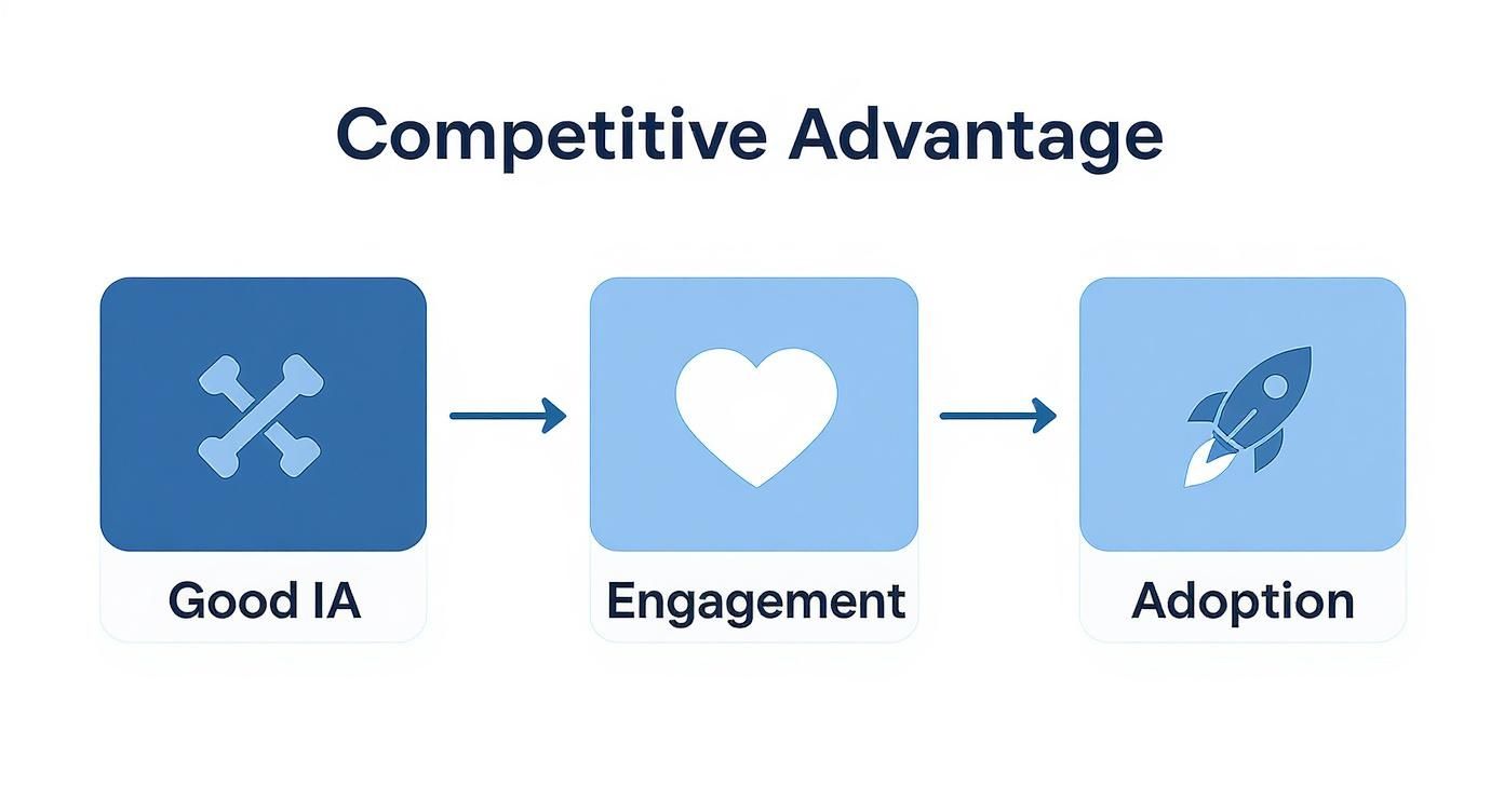
As you can see, a good blueprint (IA) leads directly to an experience people want to use (Engagement) and eventually can't live without (Adoption).
Step 4: Map the User Journey with Flow Diagrams
With your categories sorted out, the next step is to map how people will actually move through your app to get things done. A user flow diagram is a visual map of a user's path to accomplish a goal, like creating and sharing a new video. It connects the dots between different screens and actions.
This is where you spot the potential roadblocks. A flow diagram might reveal that finding the "Help" section takes four clicks, which is far too many. It helps you find those dead ends and confusing loops before they ever frustrate a real user. Properly documenting these flows is a crucial part of any project, and a number of great software documentation tools can help you manage these diagrams and other key assets.
Creating user flow diagrams helps you move beyond static screens and start thinking about the dynamic experience of using your app. It shifts your perspective from what the app contains to how people will interact with it.
Step 5: Test Your Structure with Wireframes and Prototypes
Finally, before you even think about writing code, it's time to test your structure. Wireframes are bare-bones sketches of your app's layout. They have no color, no fancy fonts—just boxes and text focused entirely on structure and hierarchy. You can link these simple screens together to create a basic, clickable prototype.
Then, put it in front of a few potential users. Give them a simple task, like "change the cursor color" or "find the export settings." Watch them closely. Where do they get stuck? Where do they hesitate? This early feedback is pure gold. It allows you to fix major structural problems when it’s still cheap and easy to do so, ensuring the final app is built on a solid foundation that you know works for real people.
Where Did Information Architecture Come From?
To really get a handle on information architecture, it helps to rewind the clock. This isn't some new-fangled concept born from the internet; its roots run deep, weaving through fields like library science and cognitive psychology. For centuries, librarians were the original information architects, devising brilliant systems like the Dewey Decimal System to help people find a single book among thousands.
They understood a simple, powerful truth: information is useless if you can’t find it.
This very idea was the blueprint for organizing the digital world. As we moved from clunky early databases to the personal computing boom—spearheaded by platforms like the Mac—the need for a logical system became urgent. The 1984 Macintosh's graphical user interface, with its iconic desktop, files, and folders, was a watershed moment. It took the abstract chaos of a file system and made it something anyone could intuitively understand.
A Niche Idea Goes Mainstream
The folks who first put a name to IA were often architects and designers. They saw a clear connection between how we navigate a physical building and how we move through a digital space. A building without a blueprint is just a confusing mess of rooms, and a website or app without a plan is no different. It becomes a frustrating maze where users get lost and valuable content stays hidden.
This is why what is information architecture is more than just a buzzword. It’s a foundational practice built on understanding how people think and behave. We don’t want to learn a whole new system every time we open an app; we crave familiar patterns that let us get things done without thinking about how to do them.
The best information architecture is invisible. It’s the silent force that makes a complex macOS app feel simple, guiding users with an unseen hand so they can focus on their tasks, not on figuring out the interface.
As the digital realm exploded, this way of thinking caught on. The discipline of information architecture began to truly formalize in the 1980s, moving beyond simple database management to a bigger-picture view of how information flows through entire organizations. By the late 1980s, an impressive 75% of Fortune 500 companies were already applying these principles.
This history isn't just a fun fact; it shows us that the core ideas we rely on today are built on a solid foundation. You can read more about the field's early development to see how these foundational concepts evolved into the practices that shape our digital experiences.
Got Questions About Information Architecture?
Even after you've got the basics down, you'll probably still have a few questions when it comes time to actually do the work. Let's dig into some of the most common ones that pop up, especially for folks building things on a Mac.
So, What's the Real Difference Between IA and UX?
This one comes up all the time. It's easy to get them mixed up, but the distinction is pretty important.
Think of it like building a house. Information Architecture (IA) is the blueprint. It’s the structural plan that decides where the kitchen, bedrooms, and hallways go so the layout makes sense and you can move around easily.
User Experience (UX) is the entire feeling of living in that house. It includes the blueprint, but it's also about the color of the paint, the style of the doorknobs, the way light comes through the windows—everything that makes the house a comfortable, enjoyable place to be.
IA is a critical part of UX, but UX is the whole picture. You can't have a great user experience with a confusing, illogical structure, which is why a solid IA is the foundation for any good design.
What Tools Should I Use on My Mac? And How Do I Spot Bad IA?
You don’t need to spend a fortune on complicated software to start mapping out your app's structure. Some of the best tools for the job are probably already familiar to you:
- MindNode: Absolutely fantastic for brainstorming and creating visual sitemaps. It's my go-to for just getting ideas out and seeing the hierarchy take shape.
- Sketch or Figma: Once you have a structure in mind, these are perfect for building out wireframes or even simple, clickable prototypes to see if your IA holds up in practice.
- OmniGraffle: If you need more horsepower for really detailed flow diagrams and complex user journeys, this is a powerful choice.
Now, how do you know if your own IA is failing? It's not always obvious when you're deep in a project.
Here's a quick test: Ask a new user where they think they would find a specific feature. If their first guess is right most of the time, you've got a pretty intuitive structure.
Keep an eye out for these red flags. Answering "yes" to any of them is a strong signal that you need to go back to your blueprint:
- Confusing Navigation: Are people constantly clicking the wrong menu item or using the back button like a lifeline?
- Hidden Features: Did you build an amazing tool that's buried three levels deep where nobody will ever find it?
- Inconsistent Labeling: Do you call the same action "Save" in one place and "Update" in another?
- High Drop-Off Rates: Are your analytics showing that users are bailing on a task at the exact same spot?
Ready to create product videos that showcase your app's brilliant design without the hassle? Screen Charm provides all the tools you need to produce polished, engaging demos right on your Mac. Learn more and get your copy today at screencharm.com.