Visual hierarchy is all about arranging what's on the screen to show what’s most important. Think of it as the art of visual storytelling—it guides a user’s eye from the main event down to the supporting details. For macOS applications, it's the secret ingredient that makes an interface feel intuitive, using things like size, color, and spacing to tell someone what to look at first in a familiar, Mac-like way.
Why Visual Hierarchy Is Your App's Silent Guide
Picture your macOS app having a conversation with a new user. Visual hierarchy is what sets the tone and flow of that conversation. It makes sure the most important messages are delivered loud and clear, while the less critical details whisper in the background, ready when needed. Without it, your interface is just a noisy room where everyone is shouting at once.
This isn't about following a strict set of rules; it's about understanding how people naturally see and process information within the macOS environment. When you open a great app, you don’t have to think about where to click—you just know. That feeling of effortlessness is a direct result of a solid visual hierarchy. It’s what turns a jumble of buttons, text, and images into a clear path.
The Roadmap to Intuitive Design
One of the most powerful ways visual hierarchy works is through a well-thought-out navigation system. A clear navigation makes the most important user journeys obvious. Good navigation design breaks down how structure creates clarity. For macOS apps, this means making your main actions pop while secondary options are easy to find but don't steal the show.
The whole point is to reduce the mental effort for the user. When someone can quickly scan your app and understand what to do, they get things done faster and with way less frustration. Studies have shown that a clear visual path can boost task success rates by 10–40%, which is a huge win for user satisfaction.
Visual hierarchy isn't just about aesthetics. It's a strategic communication tool that cuts through confusion and helps users get where they need to go.
The principles that make this work are simple but incredibly powerful. They tap into how our brains are wired to process visual information—a core concept in what is visual learning. By getting these techniques right, you can build macOS apps that feel less like clunky software and more like a genuinely helpful assistant.
The Unspoken Rules of Visual Organization
Great visual hierarchy isn't magic. It's a deliberate system built on a handful of core principles that guide our eyes and tell us what matters most on a screen. Think of these as the unspoken rules that turn a chaotic interface into something that just feels right, especially in a polished environment like macOS. Once you get these down, you can lead users through your app without them even noticing.
The main principles we're talking about are Size and Scale, Color and Contrast, Typography, Spacing, and Alignment. When they work together, they create a clear, logical path for the user's attention, making an interface intuitive and effortless. These are the fundamental building blocks of a solid design.
This diagram breaks down how core pillars like size, color, and spacing really form the foundation of visual hierarchy.
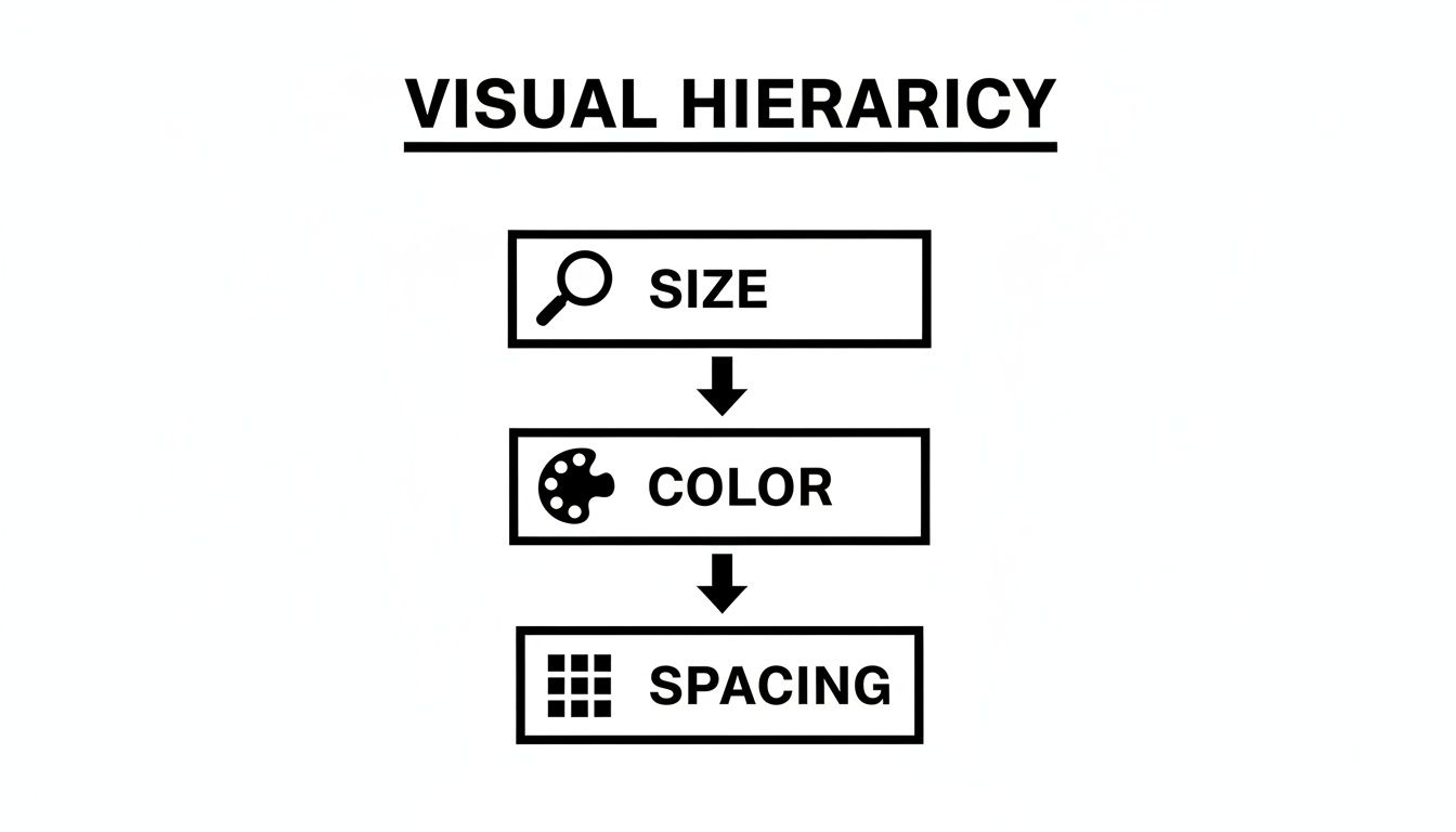
You can see a clear top-down flow here. Size has the most immediate, powerful impact on what we see first. After that, Color and Spacing come in to refine the structure and support the whole system.
Size and Typography: The Loudspeakers
In any design, bigger things get noticed first. It’s that simple. This is easily the most powerful tool in your hierarchy toolkit. A huge headline is the first thing you read; a massive button is the first thing you want to click. But it’s not just about grabbing attention—it’s about signaling what's most important.
Typography is where size really starts to sing. A well-defined typographic scale creates instant clarity between different levels of information. For macOS apps, a great starting point is to align with Apple's Human Interface Guidelines and stick to a simple three-tier system. Many UX experts recommend limiting your font sizes to just three main tiers (small, medium, large) to keep the reading order clean and uncluttered.
For instance, you might use:
- 14–16px for body text
- 18–22px for subheaders
- Up to 32px for primary headers
This kind of clear structure helps maintain both readability and accessibility.
Spacing and Alignment: The Organizers
If size is the voice, then spacing and alignment are the grammar that holds the conversation together. Spacing, also called negative space, is all about defining relationships. When you place elements close together, our brains instinctively see them as a related group. Pull them apart, and they become distinct.
Using a consistent spacing system, like an 8-point grid, is a professional standard for macOS development. It ensures every element has a deliberate, measured relationship with its neighbors, which gets rid of visual clutter and creates a wonderful sense of order.
Alignment works hand-in-hand with spacing to create clean lines and structure. A consistent alignment—whether it’s to the left, right, or center—draws an invisible line that connects different elements. This makes the entire layout feel cohesive and polished. It's a foundational part of building a logical flow, a concept we dive into in our guide on what is information architecture.
Color and Contrast: The Spotlight
Color and contrast are your spotlights. They’re fantastic for drawing the eye and signaling function. A bright, high-contrast button for your main call-to-action practically screams, "Click me!" while muted, softer tones can make other elements recede into the background.
But here’s a critical point: never rely on color alone. Roughly 8% of males have some form of color vision deficiency, so a design that only uses color to communicate is bound to fail.
Instead, think of color as a way to support the hierarchy you've already built with size and spacing. For example, the primary action button in a macOS app shouldn't just have a distinct color—it should also be large. If you want to see how these principles are baked into a product's DNA, you can explore how design systems codify visual organization.
Sponsored by the makers
Tired of boring screen recordings?
Try Screen Charm.
Auto-zoom, motion blur, camera overlay, and background music. All built in. Record once, export a polished video.
See what it doesSeeing Great Design in Your Everyday macOS Apps
Theory is one thing, but seeing it in action is where the lightbulb really goes on. You don't have to hunt for brilliant examples of visual hierarchy—they're right there in the macOS apps you probably use every day. By taking a closer look at interfaces like Finder and Calendar, we can see exactly how Apple's designers masterfully guide our attention.
These apps just feel right. Why? Because every element has a clear purpose and a logical place. The consistent use of size, spacing, and contrast across the entire OS builds a familiar and predictable world where you instinctively know what to do next. That's the sign of a truly effective design system.
Just look at a typical macOS screen. You can spot these principles everywhere.
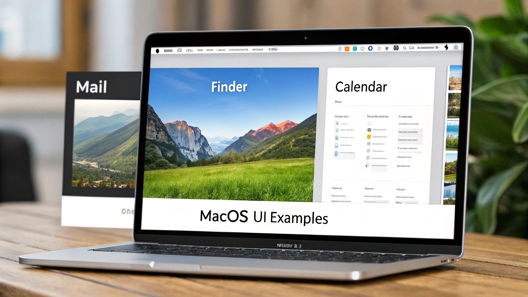
This screenshot is a perfect example of how size, boldness, and color work together to separate primary navigation (the Finder sidebar) from specific content (like calendar events), making the user’s journey feel effortless.
Finder: A Masterclass in Clarity
Pop open a Finder window and look at the sidebar. See how the section headers like "Favorites" and "Tags" are just a little larger and bolder than the items listed below them? That one tiny typographic tweak instantly creates a parent-child relationship. Your brain immediately gets that "Applications" and "Documents" are part of "Favorites" without even thinking about it.
Icons add another layer to this. The colorful tags really pop against the simple blue folder icons, making them easy to pick out in a quick scan. This blend of size, typography, and color creates a navigation system that’s organized, scannable, and feels completely natural to use.
Calendar: Juggling Your Day with Color
Apple's Calendar app is another fantastic case study. Here, color isn't just for looks; it's a powerful organizational tool. You can assign different colors to different calendars—work, personal, family—and understand your day’s context at a single glance. A block of blue instantly registers as a work meeting, while a red entry might be a doctor's appointment.
Visual hierarchy in macOS isn't about flashy effects. It's about using subtle, consistent cues to create an interface that is clear, predictable, and remarkably easy to navigate.
This color-coding works hand-in-hand with the hierarchy set by text and spacing. Event titles are the most prominent text on the screen, while details like time and location are smaller and less emphasized. This layering of visual signals turns a potentially overwhelming schedule into something clean and easy to digest.
These smart design choices are fundamental to telling a clear story, a concept you can dive deeper into by understanding what is visual storytelling. Once you see how these native apps put the core principles to work, you'll have a much better roadmap for making your own apps feel just as intuitive.
Bringing Clarity to Complex Data and Dashboards
Stare at a wall of numbers for too long, and it all starts to blur. This is a huge problem for data-heavy apps—analytics dashboards, financial tools, and reporting interfaces. In these cases, a strong visual hierarchy in design isn't just a nice touch; it's an absolute necessity. Without it, users are left adrift in a sea of data, unable to separate the signal from the noise.
Your job as a macOS app developer is to turn what looks like a dense spreadsheet into an actionable story. This means using hierarchy to shine a spotlight on the most critical information, guiding your user's eye directly to the key performance indicators (KPIs) or trends that need their attention first.

This isn’t just about aesthetics; it has a real impact. Research has shown that something as simple as placing the most critical KPI in the top-left of a dashboard and using a larger font can cut the time it takes for a user to find insights by a staggering 20–50%. When you deliberately structure dashboards with a clear order of importance—top KPIs first, supporting charts second—teams see a real drop in decision time and fewer errors during analytics reviews. If you want to dive deeper, QuantHub.com has a great piece on how logical hierarchy improves chart designs.
The Squint Test: A Quick Diagnostic
Here’s a powerful little trick for checking your work: the squint test. Seriously. Just step back from your screen and squint until the interface becomes a blurry mess. What still stands out? Are those the most important parts?
If your main KPI, a critical alert, or the primary trendline just fades into the background, your hierarchy needs a rethink. The elements that remain visible are the ones with the most visual weight. The squint test is a gut check that instantly tells you whether you're drawing attention where it needs to be.
In data visualization, if everything is emphasized, then nothing is emphasized. The squint test is your fastest way to check if your key data points are truly the heroes of the story.
This simple exercise ensures your design choices are actually helping the user understand the data, not just making it look busy. It’s a fundamental check for any macOS developer building an analytics or reporting feature.
Actionable Strategies for Data Clarity
Alright, let's move from theory to practice. You don't need a massive overhaul; small, intentional changes can make all the difference in how users read complex information on their Mac.
Here are a few concrete strategies you can use right away:
- Use a Single Accent Color: Got a chart with multiple lines or bars? Turn all but the most important one a neutral gray. Then, use a single, bright brand color to make the key data line pop. Instant focus.
- Emphasize Primary KPIs: Make the numbers for your main KPIs significantly larger and bolder than anything else on the screen. Stick them in the top-left corner, which is where the eye naturally goes first.
- Vary Chart Weight: Use a thicker, bolder line for your primary data series and thinner, fainter lines for secondary or comparative data. This simple tweak immediately creates a clear layer of importance.
By putting these targeted techniques to work, you can guide users through even the most complex datasets, turning what could be overwhelming confusion into clear, immediate insight.
Common Design Traps and How to Avoid Them
Even designers with years of experience can stumble when it comes to visual hierarchy. The good news is that knowing what these common traps look like is the first step to sidestepping them entirely. Most of these mistakes come from a good place—wanting to highlight important features—but end up creating a confusing mess instead of a clear path for the user.
One of the most common issues I see is the “shouting match.” This is what happens when too many elements on the screen are fighting for the user's attention. When every button is a bright color and every headline is in a massive, bold font, nothing actually stands out. It just creates a wall of visual noise that overwhelms the user and makes it impossible to figure out what to do next.
A design where everything is emphasized is a design where nothing is emphasized. You're trying to have a clear conversation with the user, not start a chaotic argument between interface elements.
Another classic mistake is using weak or insufficient contrast. This isn't just a minor stylistic issue; it makes text genuinely difficult to read and can create major accessibility problems for users with visual impairments. For any macOS app to feel polished and professional, the text needs to be crisp and every interactive element has to be instantly distinguishable from its background.
Fixing Common Hierarchy Problems
Thankfully, once you know what to look for, these traps are pretty easy to avoid. It just takes a bit of discipline and a commitment to clarity. By being intentional with every choice—from the exact hex code of a color to the pixels between elements—you can refine your visual hierarchy in design and build a much more intuitive experience.
-
The Problem: The "Shouting Match"
- Symptom: You've got multiple elements competing for the spotlight with loud colors, bold fonts, and large sizes. The user’s eyes dart all over the screen because they have no idea where to look first.
- Solution: You have to be ruthless with prioritization. Pick one—and only one—primary call-to-action for each screen. Give that single element your brightest color and most prominent size, then deliberately tone down everything else around it.
-
The Problem: Inconsistent Spacing
- Symptom: Things just feel…off. Elements seem randomly placed, and it’s hard to tell which items are related to each other. The whole layout looks cluttered and unprofessional.
- Solution: Commit to a strict grid system. Using an 8-point grid is a fantastic starting point. This forces consistency, creates obvious visual groupings, and brings a calming sense of order to the entire interface.
Steering clear of these pitfalls will make your macOS app feel more professional, look more polished, and—most importantly—be a whole lot easier for your users to navigate.
Got Questions About Visual Hierarchy? We've Got Answers.
When you start applying these principles, a few common questions always pop up, especially when you're trying to design for a clean, polished ecosystem like macOS. How do you build a strong hierarchy in a minimalist design without just adding a bunch of junk to the screen? The secret is to think subtly.
In minimalist design, visual hierarchy isn't about adding more elements; it's about being more intentional with the few you have. Whitespace, typography, and slight shifts in contrast become your best friends.
So, how do you know if you've actually succeeded? The "squint test" is a fantastic gut check, but nothing beats getting direct feedback from real people. Watching someone try to find a specific feature in your macOS app is the ultimate test—their journey will show you exactly how well your visual cues are working.
Another question I hear all the time is about fonts. To keep things looking professional and support a visual hierarchy in design, follow one simple rule: stick to two font families, max. Honestly, you can often get everything you need from a single, versatile font family that has multiple weights (like light, regular, and bold). That’s usually more than enough to create clear distinctions between your headlines, subheadings, and body text while keeping the interface feeling sharp.
Ready to create product demos where your visual hierarchy is crystal clear? The auto-zoom feature in Screen Charm automatically draws your viewer's eye to the most important action, ensuring no one ever misses the point. See how Screen Charm can guide your audience's focus.