At its core, visual communication is all about using images, graphics, and video to get a point across more effectively than you could with just words. Think of it as a universal language. Our brains are naturally wired to "get it" almost instantly.
In a world overflowing with information, powerful visuals are what cut through the digital noise. They grab our attention and make even the most complicated ideas feel simple and easy to digest, especially within the clean, intuitive world of macOS.
What Is Visual Communication
Visual communication isn't just about aesthetics or making things look nice; it’s a smart, strategic way to share information. Instead of forcing someone to read dense paragraphs to understand a process, you use visual cues to guide them. For macOS users, this could be anything from a polished Keynote presentation to a clear, step-by-step app tutorial.
This method works so well because it taps directly into how our brains operate. Research shows that our brains process images a staggering 60,000 times faster than plain text. It’s no wonder visuals are an incredible tool for engagement and memory. In fact, studies show that using visuals can boost memory retention by as much as 74%, which is a huge advantage in any professional setting. For a deeper dive into its market impact, check out these recent industry reports.
Ultimately, good visual communication turns abstract concepts into something tangible and unforgettable.
It's the difference between reading a long, text-based manual and watching a short, clear video tutorial that shows you exactly what to do on your Mac screen.
When you blend images, text, and thoughtful design, you create a much stronger narrative. This ties directly into using visuals to craft a compelling narrative, a topic we explore further in our guide on what is visual storytelling. Honing this skill will help you communicate with more impact, no matter what you do.
The Building Blocks of Powerful Visuals on macOS
So you know what visual communication is, but how do you actually make visuals that work? The secret isn’t some complicated design theory; it's about a few simple, powerful concepts that separate clarity from total confusion. Once you get a handle on these ideas, the work you do on your Mac will become dramatically more effective.
At the very core of this is a solid brand identity. As this a comprehensive guide to brand identity design explains, everything from your logo to your color choices sends a message. Keeping these elements consistent is what makes your work instantly recognizable.
Guiding the Viewer's Eye
The best visuals aren’t just a random collection of items; they’re intentionally designed to guide the viewer’s attention. This is done by putting a few fundamental building blocks to work.
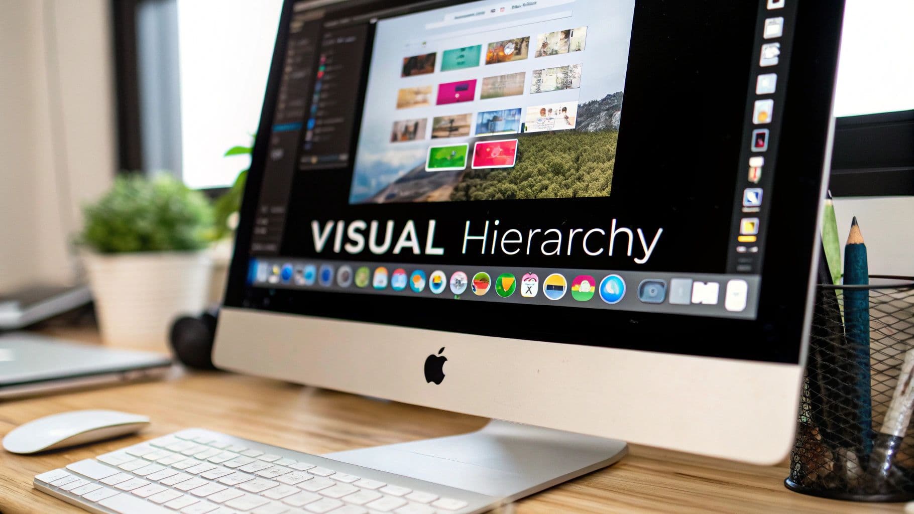
- Hierarchy: This is all about making the most important thing stand out. Think about a Keynote slide—you make the headline the biggest text on the screen to tell your audience, "Hey, look here first!"
- Contrast: Using different colors, sizes, or shapes helps create visual interest and makes information way easier to digest. Look at the bright, colorful app icons against the muted background of your macOS Dock. They pop for a reason.
- Alignment: This brings a sense of order to the chaos. When you're in a Pages document, aligning your text and images to an invisible grid makes the whole layout feel clean and professional, not scattered and messy.
This concept map breaks down how a central idea can branch out into different visual formats.
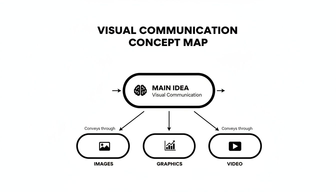
It’s a great reminder that whether you’re using static images, slick graphics, or a full-blown video, the goal is always to communicate ideas clearly.
The goal isn't just to add visuals; it's to arrange them with purpose. Effective visual communication transforms a collection of elements into a clear story that requires minimal effort from the viewer to understand.
When you start applying these principles, you stop just making content and start creating polished, compelling communication.
Sponsored by the makers
Tired of boring screen recordings?
Try Screen Charm.
Auto-zoom, motion blur, camera overlay, and background music. All built in. Record once, export a polished video.
See what it doesWhy Visuals Are a Superpower for Business Growth
Learning to communicate visually is far more than a creative exercise—it’s a straight-up engine for business growth. When you get it right, powerful visuals deliver tangible results. We're talking about better engagement, stronger brand recall, and the ability to make dense, complex data instantly click for your audience.
This isn't just a nice theory. For a macOS app developer, a crystal-clear user interface (UI) isn't just about looking slick; it directly cuts down on the number of customer support tickets they receive. The design itself guides users, answering questions before they even think to ask.
In the same way, an annual report can go from being an intimidating wall of text to an engaging infographic. Suddenly, key performance indicators are easy for everyone to grasp, not just the data analysts.
Driving Engagement and Simplifying Complexity
Great visuals don't just grab attention; they hold it. They have a unique way of cutting through the noise, making it easier for customers to understand your product or message. This clarity builds trust and keeps them coming back.
Just look at a highly competitive field like real estate. Visuals are everything. For a deeper dive into how this plays out, check out these insights on creating real estate ads that truly sell, where a single powerful image can turn a listing into a must-see property.
In business, clarity is currency. Visual communication is the fastest way to convey a message, ensure it is understood, and inspire action.
This is especially true for video content, which has become a non-negotiable part of modern marketing. You can see how even small operations can make a huge splash in our guide on video marketing for small business.
A Market That's Only Getting Bigger
Putting real effort into your visual strategy gives you a serious competitive edge, and the numbers back it up. The global visual communication market was recently valued at a massive USD 33.07 billion.
Even more impressive? It's projected to nearly double, rocketing to USD 62.01 billion by 2035. This incredible growth is happening because businesses everywhere need dynamic ways to capture and hold audience attention.
Creating Professional Visual Demos on Your Mac
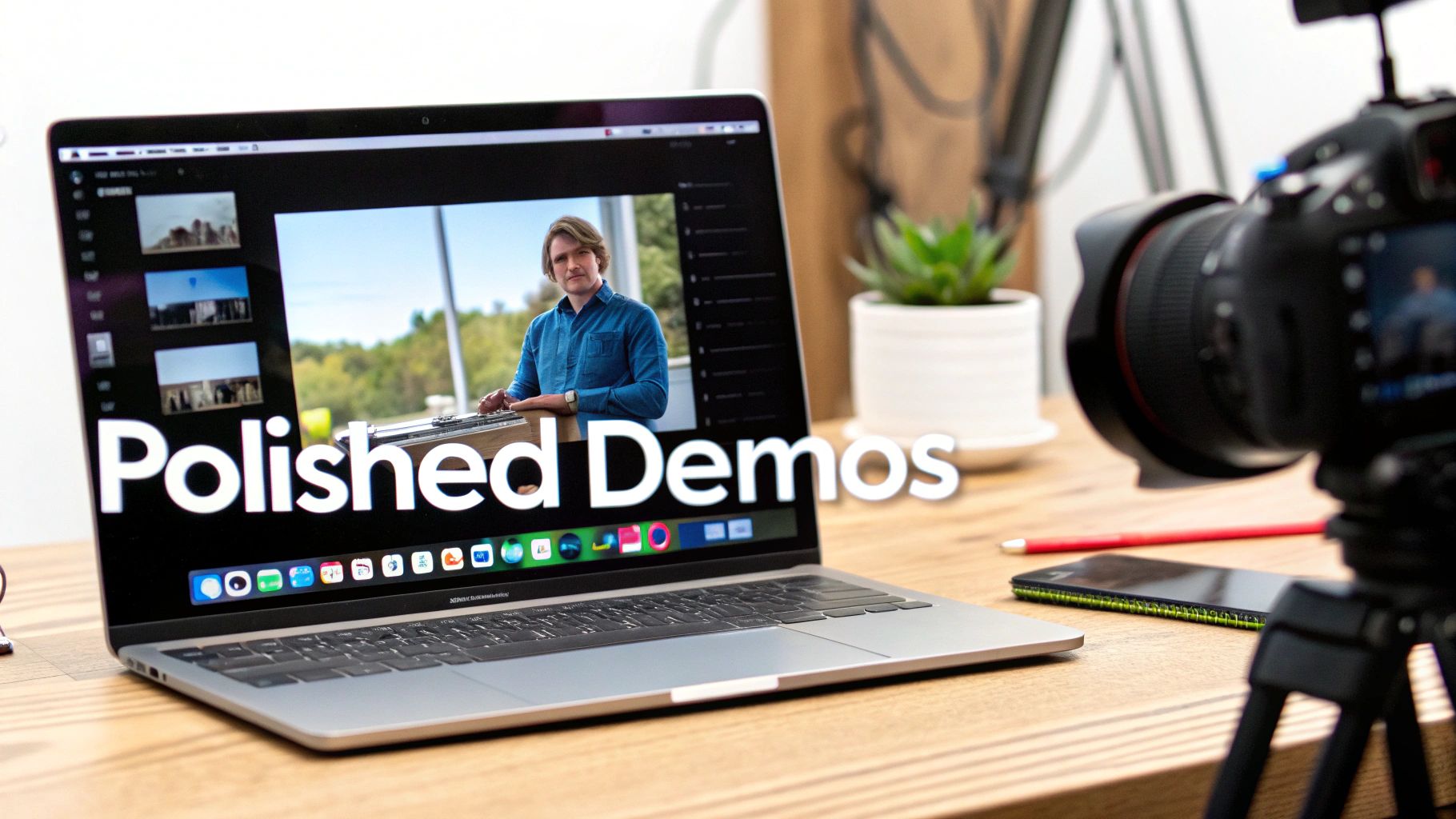
Knowing the theory behind visual communication is great, but the real magic happens when you put it into practice. If you’re a macOS user, creating a product demo or a quick tutorial is the perfect way to do just that. The goal isn't just to record your screen; it's to craft a professional, easy-to-follow visual story that actually helps your audience.
This is where having the right tool changes everything. Sure, macOS has a built-in screen recorder in QuickTime, but it often stops short of what you need to really guide a viewer's attention. A raw, unedited recording can be confusing and messy, completely undermining the message you’re trying to share.
A dedicated Mac tool helps you nail principles like visual hierarchy and focus without needing a degree in video editing. It makes even the most complex software look simple and intuitive.
Turn Standard Recordings into Polished Stories
The secret to a fantastic demo is controlling exactly what your viewer sees, and when they see it. This is the heart of what is visual communication—directing attention on purpose. Instead of showing your entire chaotic desktop, a great tool helps you zoom in on the details that matter.
This is precisely why we built Screen Charm for Mac users. It was designed from the ground up to turn a basic screen capture into a polished, professional-looking visual guide. Every feature is centered on making powerful visual communication on macOS feel effortless.
Effective demos don't just show a screen; they tell a story. By focusing the viewer's attention on key actions and outcomes, you create a narrative that is both educational and engaging.
Features That Enhance Visual Clarity
To make truly compelling videos, you need tools that handle the tedious, detailed work for you. This frees you up to focus on your message, not on fiddling with complicated video editing software on your Mac.
A few key features completely transform a standard recording:
- Automated Zoom: The software intelligently follows your cursor, automatically zooming in on clicks and important parts of the interface. This creates a dynamic, smooth focus that naturally draws the viewer’s eye to the action.
- Elegant Annotations: Simple, clean on-screen notes help you point out critical information without cluttering the view. It’s all about adding context while keeping things looking sharp and professional.
- Seamless Export Options: When you're done, you can export a high-resolution video in seconds. This means you can share your work instantly, knowing it will look great on any platform.
Let's look at how this approach compares to the old way of doing things.
Traditional Recording vs Screen Charm on macOS
| Feature | Traditional Screen Recording on Mac | Screen Charm |
|---|---|---|
| Zoom & Focus | Requires iMovie or Final Cut Pro for manual editing; time-consuming and often jerky. | Automatic pan and zoom follows cursor and clicks, creating a smooth, dynamic focus. |
| Annotations | Requires separate video editing software; can look cluttered or unprofessional. | Clean, built-in annotations for highlighting key info without distracting the viewer. |
| Workflow | Record with QuickTime, then spend hours editing, trimming, and adding effects. | Record and produce a polished video in minutes. The heavy lifting is done for you. |
| Exporting | Multiple steps to render and export, often with complex settings. | One-click export to share a professional-looking MP4 or GIF instantly. |
Ultimately, the right tool removes the friction between your idea and the final, polished video.
If you want to get a handle on the fundamentals first, our guide on how to screencast on Mac is a fantastic place to start. By combining your Mac’s power with a smart tool, you can create demos that don’t just show—they teach, persuade, and captivate.
How Visuals Speak a Universal Language
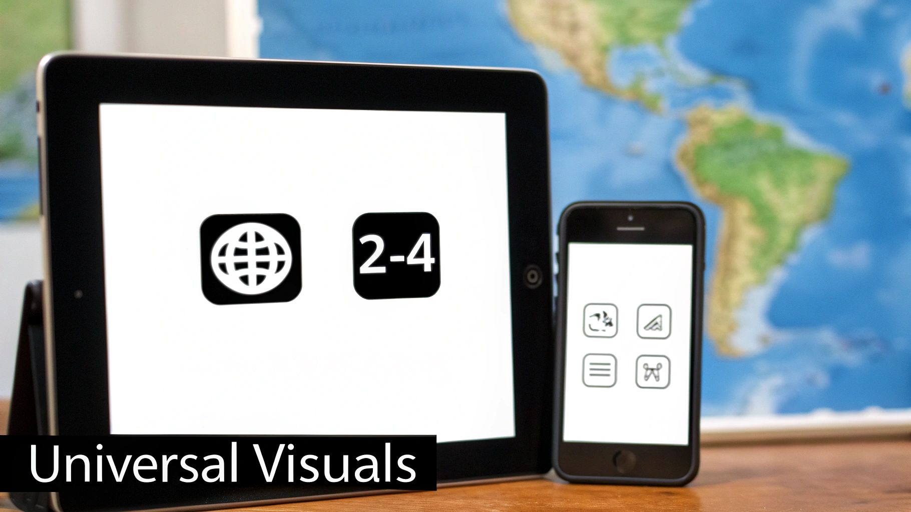
The real magic of visual communication lies in its ability to tear down walls. A well-designed icon or symbol can speak to people everywhere, moving beyond the limits of language and culture. Just think about the icons on your Mac’s Dock—the Finder icon for files or the trash can for deleting. You know what they mean instantly, no translation required.
This is the engine driving effective graphic communications worldwide. Simple things like colors, lines, and shapes can send a message or spark an emotion in a massive audience, regardless of where they live or what language they speak. As more people get online globally, this visual-first approach is becoming absolutely essential. You can dig deeper into the growth of the global graphic communications market to see just how big this trend is.
The Apple Example on macOS
Global brands like Apple have this down to a science. Take a look at macOS—its visual identity is rock-solid across every single one of their platforms.
A consistent visual language builds instant recognition and trust. Whether you are in Tokyo or Toronto, the experience of using a Mac feels familiar because its visual cues are universal.
This kind of consistency makes an interface feel like second nature. In a world that’s more connected than ever, understanding what is visual communication isn't just a niche design skill anymore—it’s a fundamental part of how we connect with each other across the globe.
Your Visual Communication Questions Answered
We get a lot of questions about visual communication. Here are some of the most common ones, with practical advice to help you start applying these ideas right on your Mac.
What Are the First Steps to Improve My Visual Communication Skills?
The best place to start is by simply paying attention. Look at the macOS apps, websites, and presentations you admire. Ask yourself what makes them feel so intuitive or look so clean. You'll start noticing the little things that make a big difference.
After that, just start making things. Don't overthink it. Open up Keynote or Pages and play around with a single principle. Today, focus on creating better contrast. Tomorrow, practice aligning objects on a grid. You'll be surprised how quickly these small, consistent efforts build real skill.
Do I Need to Be a Designer to Communicate Visually?
Absolutely not. Think of it like this: you don't need to be a novelist to write a clear email. Visual communication isn't about becoming a professional artist; it's about learning the fundamentals to make your message clear, engaging, and memorable.
This is exactly why tools like Screen Charm exist for macOS. They're built for people who aren't designers, giving you the power to create polished, professional-looking content without ever needing a design degree. It handles the hard parts for you.
How Is Visual Communication Different from Graphic Design?
It's a "why" versus "how" situation.
Visual communication is the "why"—it's the overall strategy you use to get a message across using images, layout, and color. It's about clarity and impact.
Graphic design is the "how"—it's the craft of actually creating those visual elements, like logos, icons, and page layouts. It's one of the key skills used to execute a visual communication strategy. In short, graphic design is a tool in the visual communication toolbox.
Ready to create stunning, professional-looking demos on your Mac in minutes? Screen Charm removes the complexity, letting you focus on your message. Get started with Screen Charm today and turn your ideas into compelling visual stories.