10 YouTube Thumbnail Design Tips for macOS Creators in 2026
In the crowded landscape of YouTube, your thumbnail is your first and often only chance to capture a viewer's attention. It's more than just a preview; it's a digital billboard competing for clicks in a sea of content. A great thumbnail tells a story, evokes emotion, and makes a clear promise that your video will deliver on. Get it right, and your click-through rate (CTR) soars. Get it wrong, and your meticulously crafted content gets lost in the algorithm.
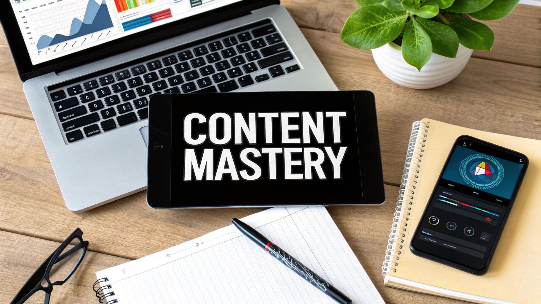
This guide provides 10 essential YouTube thumbnail design tips, with a special focus on practical workflows and tools for macOS creators. We’ll move beyond generic advice to give you actionable strategies for creating thumbnails that not only look professional but also drive measurable results. Whether you're an indie maker creating product demos, an educator producing tutorials, or a marketing professional crafting promotional videos, these techniques will help you turn casual scrollers into dedicated viewers.
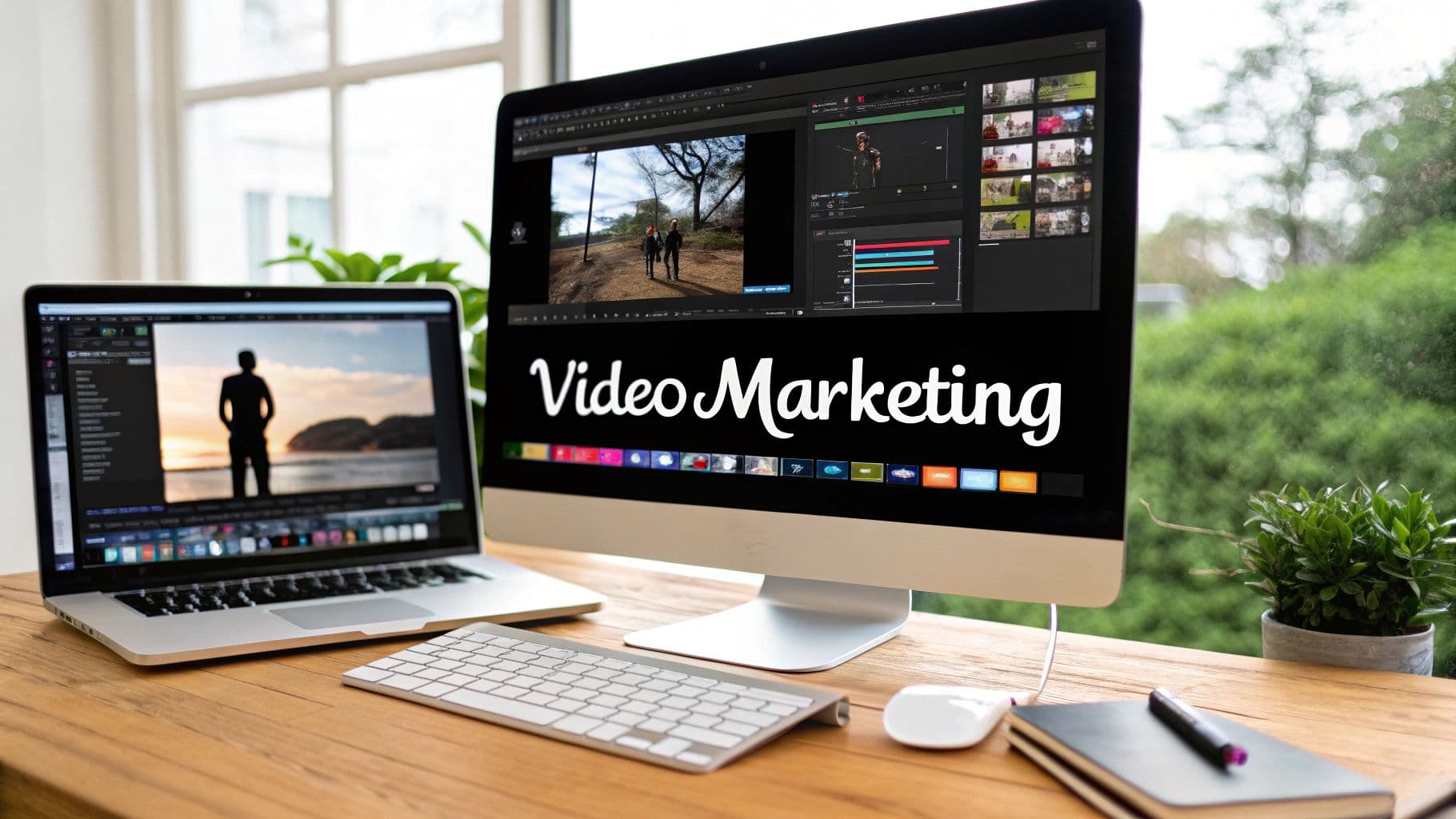
By mastering the art of the thumbnail, you build a powerful engine for channel growth. Strong visuals directly impact your video's initial performance, which in turn influences its long-term discoverability. This visual-first approach is crucial for all content formats. For instance, understanding how to effectively monetize YouTube Shorts can complement your broader strategy for attracting viewers through compelling thumbnails on all your video content. In the following sections, we will explore specific, repeatable techniques to ensure your video’s first impression is a powerful one. We'll cover everything from color theory and composition to branding, A/B testing, and a step-by-step workflow for capturing the perfect thumbnail frame on your Mac.
1. High Contrast Colors
On a platform crowded with visual information, your thumbnail’s first job is to get noticed. High-contrast colors are the most effective tool for achieving this, ensuring your video stands out against YouTube’s interface and the endless scroll of competing content. This technique involves pairing bright, saturated colors with dark, deep tones to create a strong visual hierarchy that immediately draws the viewer's eye. It’s a foundational principle in YouTube thumbnail design tips because it makes your thumbnail legible and impactful, even at the smallest sizes on a mobile screen.
The core principle is simple: create a stark difference between the foreground and background elements. Think of MrBeast’s iconic use of vibrant yellows, magentas, and cyans set against deep blacks or reds. This isn’t just an aesthetic choice; it’s a strategic one. High contrast makes text easier to read, highlights the main subject, and communicates energy and importance before a user even reads the title.
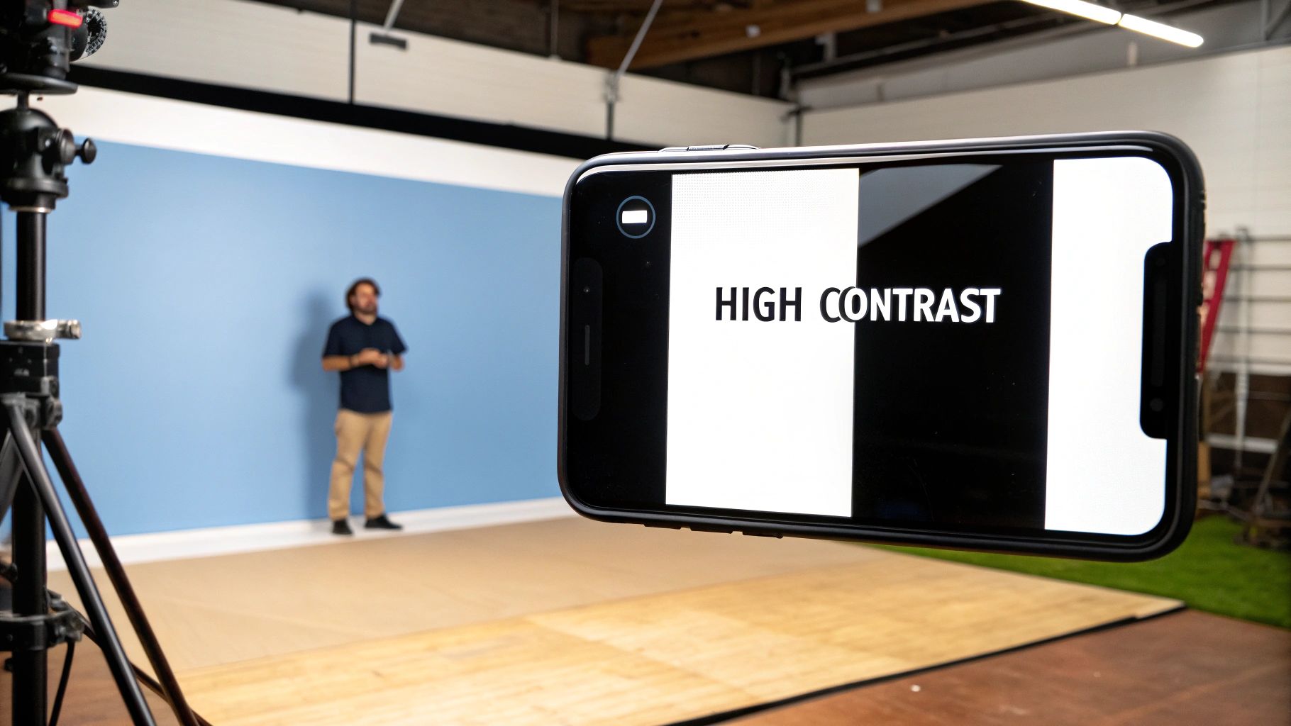
Why High Contrast is Essential
Your thumbnail appears in multiple places across YouTube: the homepage, subscription feeds, search results, and "up next" sidebars. In each location, its size varies dramatically. A design that looks great on a large monitor can become a blurry, incomprehensible smudge on a smartphone. High contrast solves this by ensuring key elements remain distinct regardless of scale. This is especially crucial for macOS creators making tutorials or product demos, where clarity and immediate recognition are paramount.
Actionable Steps for Implementation
To effectively apply high contrast, follow these practical steps:
- Master the Color Wheel: Use complementary colors (opposites on the color wheel), like blue and orange or red and green, for a powerful, eye-catching effect. For example, a bright orange product shot will pop against a deep blue background.
- Embrace the 60-30-10 Rule: For a balanced design, use a dominant color for 60% of your thumbnail (background), a secondary color for 30% (main subject or text), and an accent color for 10% (outlines, arrows, or small details).
- Test for "Squint-ability": Before publishing, shrink your thumbnail down to the size of a postage stamp or simply squint your eyes. On macOS, you can quickly preview the file with Quick Look (press Spacebar) and resize the window to simulate different thumbnail sizes. If the main subject and text are still clearly distinguishable, your contrast is effective.
- Utilize Outlines and Glows: Adding a thick, contrasting outline (like a white stroke around a person or black stroke around bright yellow text) can dramatically boost separation and readability.
Sponsored by the makers
Tired of boring screen recordings?
Try Screen Charm.
Auto-zoom, motion blur, camera overlay, and background music. All built in. Record once, export a polished video.
See what it does2. Faces with Strong Emotions
Humans are hardwired to recognize and respond to faces, making them a powerful tool in your YouTube thumbnail design tips arsenal. Featuring a face with a strong, clear emotion like shock, joy, or curiosity creates an instant connection with the viewer. This technique bypasses analytical thought and triggers an emotional response, making a potential viewer wonder, "What caused that reaction?" It’s a direct line to human curiosity and one of the most effective ways to earn a click.
This strategy is about communicating the emotional core of your video before the title is even read. When viewers see an exaggerated expression of surprise from a creator like Pokimane or an authentic look of concentration from a streamer like Valkyrae, they are immediately drawn in. The face acts as a preview of the emotional journey the video promises, compelling them to find out the source of the shock, laughter, or frustration. This makes the content feel more personal and engaging.

Why Strong Emotions are Essential
In a sea of sterile graphics and product shots, a human face provides an anchor of relatability. For macOS tutorial creators or software developers, showing genuine surprise at a new feature or frustration with a bug can make technical content feel more accessible and human. It tells the viewer that a real person is guiding them through the experience, building trust and rapport. This emotional context is crucial for transforming a simple how-to video into a memorable and engaging piece of content.
Actionable Steps for Implementation
To effectively integrate emotive faces into your thumbnails, follow these steps:
- Capture During Recording: Record your face separately in high quality while filming your screen. On macOS, you can use QuickTime Player to record your webcam feed while another program like Screen Charm captures your screen, ensuring you get crisp, well-lit reaction shots.
- Exaggerate, But Be Authentic: Your expression should be clear even at a small size, so slightly over-acting is often necessary. However, it must feel genuine to the video's content to avoid appearing like clickbait.
- Master the Composition: Position your face to occupy roughly 30-50% of the thumbnail space. It should be the primary focal point, often placed on one side following the rule of thirds, leaving room for text or graphics.
- Ensure Facial Clarity: Use good lighting to avoid shadows that obscure your expression. Make sure your eyes are in sharp focus, as they are key to conveying emotion effectively.
3. Bold, Large Text
While a picture is worth a thousand words, a few well-chosen words can provide the context that turns a glance into a click. Bold, large text on your thumbnail serves as a mini-headline, instantly communicating your video’s value proposition or core hook. This is a vital YouTube thumbnail design tip because it grabs attention and eliminates ambiguity, telling potential viewers exactly what they stand to gain or discover before they even read the video's full title. It’s about making your content's promise unmissable, even on the smallest mobile screen.
The strategy is to distill your video's main idea into a very short, high-impact phrase. Think of creators like Ali Abdaal, who uses clean, minimalist text to clearly label his productivity guides, or Miniminter, whose bold gaming overlays instantly define the video's challenge or theme. This isn’t just adding a label; it’s designing text as a primary visual element that guides the eye and sets expectations, ensuring your thumbnail works in tandem with your title to create an irresistible combination.
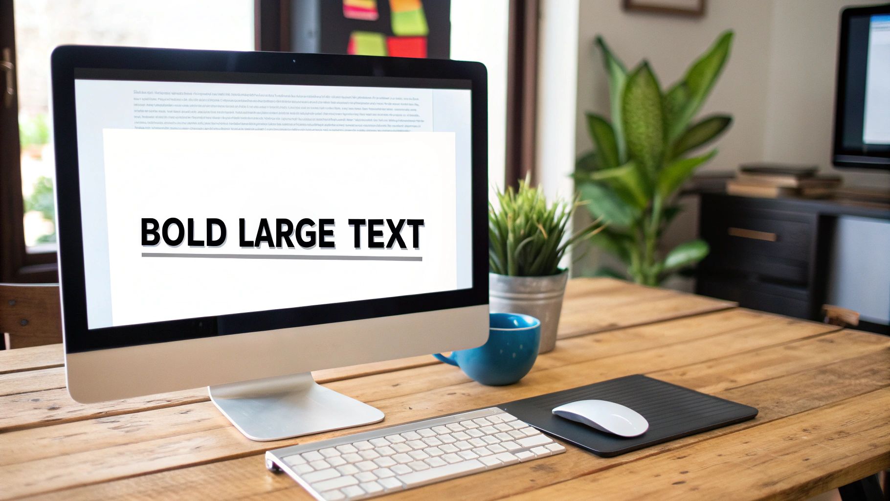
Why Bold Text is Essential
In a sea of visual content, clarity is king. A viewer scrolling through their feed makes a split-second decision on what to watch. Large text provides an immediate shortcut to understanding your video's topic. For macOS tutorials, product demos, or educational content, this is non-negotiable. Text like "macOS Sonoma Guide" or "Fix This Now" instantly qualifies your audience and communicates direct value, significantly boosting the likelihood of attracting the right viewers who will watch longer.
Actionable Steps for Implementation
To effectively use bold text in your YouTube thumbnail design, follow these practical steps:
- Keep it Concise: Limit your text to 3-5 powerful words. The goal is instant comprehension, not a full sentence. Use ALL CAPS to maximize impact and screen presence.
- Choose Legible Fonts: Opt for thick, bold, sans-serif fonts like Montserrat, Impact, or Bebas Neue. Avoid script, handwritten, or thin fonts that become unreadable when the thumbnail is scaled down.
- Ensure Contrast: Your text must stand out from the background. In macOS apps like Pixelmator Pro or Affinity Photo, add a thick stroke (outline) or a drop shadow to guarantee readability against any image.
- Test for Readability: Before publishing, zoom out on your design until it's tiny. If you can still easily read the text, you've succeeded. If it blurs into the background, increase its size, weight, or contrast.
4. Strategic Use of Arrows and Shapes
In a busy thumbnail, the viewer needs to know exactly where to look. Strategic arrows, circles, and other shapes act as visual signposts, guiding the eye directly to the most important element of your video. This technique creates an immediate focal point, answers the viewer's subconscious question of "What is this about?", and adds a layer of dynamic energy to an otherwise static image. It's one of the most direct youtube thumbnail design tips because it literally points viewers toward the value proposition.
The core principle is to eliminate ambiguity. Instead of hoping a viewer notices the key detail, you command their attention. Think of reaction channels that use a bold arrow pointing from their face to the video they're watching, or a "before and after" comparison that uses a circle to highlight the most dramatic change. These simple graphic elements improve visual flow and make your thumbnail's message instantly understandable.
Why Directional Cues are Essential
Viewers scan thumbnails in fractions of a second. Without a clear focal point, their eyes may wander, and they might miss the crucial detail that convinces them to click. Arrows and shapes prevent this by creating a strong visual hierarchy. For a macOS tutorial showing a specific setting in System Settings, a subtle circle around the correct menu item is far more effective than text alone. These cues add context and emphasis, ensuring your thumbnail communicates its core message even before the title is fully read.
Actionable Steps for Implementation
To effectively use shapes and arrows, follow these practical steps:
- Guide, Don't Obscure: Ensure your shapes highlight the key content, not cover it up. The goal is to draw attention to an element, like a new macOS feature or a surprising result, without hiding it.
- Limit to One or Two: Overloading a thumbnail with multiple arrows and circles creates visual chaos and defeats the purpose. Stick to a single, impactful directional cue to maintain a clean and focused design.
- Use Contrasting Colors: Just like with text, your shapes and arrows must stand out. Use a bright, high-contrast color that pops against the background and main subject to maximize visibility.
- Keep it Purposeful: Only add a shape if it serves a clear purpose. Ask yourself: "Does this arrow help the viewer understand the video's focus faster?" If the answer is no, leave it out.
5. Consistent Branding Elements
In a sea of content, brand recognition is your superpower. Consistent branding elements in your thumbnails act as a visual signature, training your audience to spot your videos instantly. This strategy involves using a cohesive set of colors, fonts, logos, and layout patterns across all your uploads. When viewers see your distinct style, they don't even need to read the title to know the video is yours, creating a powerful sense of familiarity and trust. It's one of the most crucial YouTube thumbnail design tips for long-term channel growth.
The goal is to build a predictable yet engaging visual identity. Think of Linus Tech Tips' iconic orange, black, and white color scheme or Unbox Therapy’s clean, minimalist aesthetic. This isn't about making every thumbnail identical; it's about creating a unified system that allows for creative variation. By establishing a consistent framework, you reduce decision fatigue and build a professional, recognizable brand that stands out in crowded subscription feeds and search results.
Why Consistent Branding is Essential
Consistency transforms individual videos into a cohesive content library. When a new viewer enjoys one of your videos, consistent branding on your other thumbnails makes it easy for them to identify and watch more of your content, boosting session time and subscriber conversion. It signals professionalism and reliability, assuring viewers that the quality they experienced in one video will likely be present in others. For macOS developers showing product demos or educators creating a tutorial series, this visual shorthand builds an immediate connection and reinforces your authority.
Actionable Steps for Implementation
To effectively apply consistent branding, follow these practical steps:
- Create a Simple Brand Guide: Define 2-3 primary colors, a consistent font for titles, and a secondary font for subtitles. Decide on a fixed location for your logo or brand mark, such as the bottom-right corner.
- Develop Template Variations: Using a macOS app like Keynote or Affinity Designer, design a few core thumbnail templates. You might have one for tutorials, one for reviews, and another for announcements. This ensures consistency while adapting to different content types.
- Place Your Logo Strategically: Always place your logo in the same spot on every thumbnail. This repetition drills your brand into the viewer’s subconscious, reinforcing recognition over time.
- Conduct Quarterly Audits: Once a quarter, review your last 10-15 thumbnails. Are they visually aligned? Does a clear brand identity emerge? This helps you stay on track and refine your system. To dive deeper, you can learn more about how to build brand awareness on screencharm.com for a comprehensive strategy.
6. Visual Hierarchy and Focal Points
A great thumbnail isn't just a collection of elements; it's a carefully organized visual story that directs the viewer's gaze. Visual hierarchy is the art of arranging these elements to guide the eye to the most important information first. By establishing a clear focal point, you tell the viewer exactly what the video is about in a fraction of a second, a crucial advantage in a competitive feed and a core tenet of effective YouTube thumbnail design tips.
The goal is to prevent visual chaos. Without a clear hierarchy, the viewer's eye wanders aimlessly, unsure where to look, and they are more likely to scroll past. A strong focal point, whether it's a person's face, a specific product, or a compelling piece of text, acts as an anchor. Think of Marques Brownlee's thumbnails, where the new MacBook is always the hero, or a design tutorial where a close-up of a finished UI element is the undeniable center of attention. This deliberate organization makes your thumbnail instantly understandable.
Why Hierarchy is Essential
A well-structured thumbnail communicates professionalism and clarity. It tells the audience that the content will be just as organized and easy to understand. For macOS creators making product demos, tutorials, or software walkthroughs, this is non-negotiable. If a viewer can't quickly grasp the subject of your thumbnail, they will assume your video is equally confusing. A strong focal point ensures your core message lands immediately, improving click-through rates by removing any guesswork for the potential viewer.
Actionable Steps for Implementation
To build a powerful visual hierarchy in your thumbnails, apply these techniques:
- Make the Main Subject Dominant: Your primary focal point should occupy a significant portion of the canvas, often around 50% of the visual weight. Use scale to communicate importance; the biggest element is what the eye sees first.
- Use the Rule of Thirds: Position your main subject or focal point along the intersecting lines of a 3x3 grid. Placing key elements slightly off-center, particularly in the upper-left or upper-right third, creates a more dynamic and visually pleasing composition.
- Guide with Gaze and Direction: If your thumbnail includes a person, have their eyes looking toward the product or text you want to highlight. Similarly, use leading lines, like the edge of a MacBook or an arrow, to direct the viewer's attention to the focal point.
- Leverage Selective Focus: Use a shallow depth of field to make your main subject sharp and clear while the background is softly blurred. This instantly separates the focal point from its surroundings, forcing the viewer's attention exactly where you want it.
7. Novelty and Curiosity Gaps
Beyond just being eye-catching, a great thumbnail tells an incomplete story that viewers feel compelled to finish. This is the power of novelty and curiosity gaps: presenting an image that is unusual, paradoxical, or intriguing enough to make a user stop and ask, "What is going on here?" This psychological trigger is one of the most powerful YouTube thumbnail design tips because it transforms a passive scroller into an engaged viewer who needs to click for the answer. It’s about creating a question in the viewer’s mind that only your video can answer.
The core principle is to show a situation or object that defies expectations. Think of 5-Minute Crafts’ thumbnails featuring everyday objects used in bizarre ways or a “before and after” image where the transformation is so dramatic it seems unbelievable. This strategy creates a powerful mental itch. The viewer sees the unexpected outcome (the "after") but is missing the process (the "how"), creating a knowledge gap they can only fill by watching your content.
Why Novelty is Essential
In a sea of tutorials and standard vlogs, novelty breaks the pattern. When every other thumbnail in a search result looks similar, yours stands out by being different. This is crucial for creators in saturated niches, like macOS productivity, tech, or lifestyle, where you need a unique hook. A thumbnail that promises a surprising result, an impossible feat, or a secret revealed immediately signals that your video offers something new and valuable, boosting your click-through rate (CTR) by tapping into our innate desire for resolution and discovery.
Actionable Steps for Implementation
To effectively leverage curiosity gaps without resorting to misleading clickbait, follow these steps:
- Show the "What," Hide the "How": Display the final, surprising result of a project or experiment but obscure the steps it took to get there. For a coding tutorial on macOS, this could be a slick, complex UI element with a title like "Build This INSANE Animation in Swift."
- Use Visual Paradoxes: Create an image that seems impossible or counterintuitive. This could be a "tiny" object shown as massive or two unrelated items combined in a strange way. The goal is to make the viewer question what they're seeing.
- Promise a Revelation: Use visuals like question marks, censored or blurred-out sections, or mystery boxes to explicitly signal that your video contains a secret or an answer. This works well for unboxings, reviews, and myth-busting content.
- Ensure a Worthy Payoff: The most critical rule is that the video content must deliver on the thumbnail's promise. If the curiosity you build is not satisfied, you risk frustrating viewers and hurting your channel’s reputation and audience retention.
8. Proper Image Quality and Resolution
Your thumbnail is the first impression of your video's production value. A blurry, pixelated, or poorly lit image signals low-quality content, deterring viewers before they even click. Proper image quality and resolution are non-negotiable foundations in any list of YouTube thumbnail design tips because they directly communicate professionalism and trustworthiness. Using crisp, clear, and well-exposed visuals ensures your thumbnail looks polished and appealing on any device, from a 4K monitor to a small phone screen.
The goal is to present a high-fidelity preview that accurately reflects the quality of your video. A sharp, high-resolution image creates an immediate perception of value and authority. Think of it as the cover of a book; a cheap, low-resolution cover often implies the content inside is equally lacking. Conversely, a high-quality image from a well-shot source photo or a crisp video frame suggests the creator has invested effort into their work, making it more enticing for potential viewers.
Why Quality and Resolution Are Crucial
YouTube recommends a thumbnail resolution of 1280x720 pixels (a 16:9 aspect ratio). Submitting an image below this standard forces the platform to upscale it, resulting in noticeable blurriness and compression artifacts. A low-quality thumbnail undermines all other design efforts, like color choice and typography, by making the entire composition look unprofessional. For macOS creators producing high-definition content, especially tutorials or product demos where detail is key, a sharp thumbnail is essential for building viewer confidence and setting clear expectations.
Actionable Steps for Implementation
To guarantee your thumbnails meet professional standards, follow these best practices:
- Start with a High-Quality Source: Whenever possible, use a dedicated high-resolution photo instead of a video screenshot. If you must use a frame from your video, ensure you export a still from the highest quality version. Using a tool like Screen Charm on macOS can help you capture pixel-perfect frames from your recordings.
- Shoot in RAW or High-Res JPG: If taking a dedicated photo for your thumbnail, shooting in RAW format provides the most flexibility for editing exposure and color without losing quality.
- Export with Correct Settings: In your macOS editing software (like Pixelmator Pro or Affinity Photo), export your final thumbnail as a JPG or PNG. Keep the quality setting high (around 80-90 for JPGs) to balance file size and visual fidelity, ensuring it stays under YouTube’s 2MB limit.
- Test on Multiple Devices: Before uploading, check how your thumbnail looks on both a large desktop screen and a small mobile device. This ensures it remains sharp and legible at all sizes. For more detail on how resolution impacts viewing experience, learn what 4K video resolution really means on screencharm.com.
9. Negative Space and Clean Design
In a visual landscape defined by bright colors and bold text, choosing to show less can paradoxically make your thumbnail stand out more. Negative space, or the empty area around your main subject, is a powerful principle in YouTube thumbnail design tips that creates a clean, professional, and focused look. By resisting the urge to fill every pixel, you allow your key elements to breathe, guiding the viewer's eye directly to what matters most.
This minimalist approach prioritizes clarity and sophistication, making it ideal for tech reviews, educational content, and brand storytelling. Think of how Apple showcases a single product against a simple background, or how channels like Unbox Therapy and Marques Brownlee (MKBHD) use clean, uncluttered compositions to convey a sense of quality and expertise. The goal is not to be empty, but to be intentional, using space to amplify the importance of the subject.
Why Clean Design is Essential
A cluttered thumbnail creates cognitive overload; a viewer doesn't know where to look and may scroll past. Negative space solves this by establishing a clear visual hierarchy. It makes text instantly readable and directs attention to the product, face, or graphic you want to highlight. This is particularly effective for macOS tutorials and product demos where the subject itself needs to be the hero. A clean design communicates confidence and professionalism, building trust before the video even starts.
Actionable Steps for Implementation
To harness the power of negative space, apply these targeted strategies:
- Aim for a 60/40 Split: Dedicate roughly 60% of your thumbnail to the focal point (your product, face, or text) and let the remaining 40% be negative space. This ensures the subject is dominant but not crowded.
- Isolate a Single Focal Point: Decide on the one most important element and build the entire thumbnail around it. Is it a new macOS software interface, a person's reaction, or a key phrase? Remove everything else that doesn't support it.
- Use Consistent, Simple Backgrounds: A solid color, a subtle gradient, or a blurred-out photo works best. This minimizes distractions and makes the foreground subject pop.
- Let Elements Breathe: Ensure there is ample padding around your text and main subject. Avoid placing them too close to the edges of the frame, which can create a cramped, unprofessional feel.
10. A/B Testing and Data-Driven Iteration
Even the most well-designed thumbnail is based on an assumption of what will perform best. A/B testing, or split testing, is the process of removing that guesswork by systematically testing multiple thumbnail variations against each other to see which one earns the most clicks. This data-driven approach, famously championed by creators like MrBeast, transforms thumbnail design from a purely creative exercise into a scientific process of optimization, ensuring your choices are backed by audience behavior, not just intuition.
The core concept is to create two or more versions of a thumbnail for a single video, changing only one significant element at a time, such as the background color, the facial expression, or the text. By showing these different versions to segments of your audience and analyzing the click-through rate (CTR), you can definitively identify which design elements resonate most effectively. This is one of the most powerful YouTube thumbnail design tips for long-term channel growth, as it builds a repository of knowledge about your specific audience's preferences.
Why Data-Driven Iteration is Essential
A design that you believe is perfect might be outperformed by a variation you almost discarded. Without testing, you're potentially leaving views on the table with every upload. This is especially critical for marketers, educators, and macOS app developers whose content value is high but may struggle to capture initial attention. Iterative testing helps you understand whether your audience responds better to a clean product shot, a screenshot of a specific macOS interface feature, or a person's emotive reaction. Over time, these small CTR gains compound into significant increases in views and channel authority.
Actionable Steps for Implementation
To effectively implement A/B testing for your thumbnails, follow these steps:
- Isolate a Single Variable: For a true test, change only one element per variation. Test a blue background versus a red one, or a smiling face versus a shocked one, but not both at once. This ensures you know exactly what caused the performance difference.
- Test High-Impact Elements First: Prioritize testing the most influential components of your thumbnail. This typically includes the main image (e.g., face vs. object), background color, text copy, and overall composition.
- Leverage YouTube's "Test & Compare" Feature: Many creators now have access to YouTube's native A/B testing tool. Use it to run tests for at least one to two weeks to gather sufficient data before declaring a winner.
- Document Everything: Keep a simple spreadsheet or a Numbers document on your Mac to track the video, the variations tested, the CTR for each, and the final winner. This data becomes an invaluable guide for future designs. For deeper insights, you can integrate this with findings from various social media analytics tools.
YouTube Thumbnail Design: 10-Point Comparison
| Technique | Complexity 🔄 | Resources & Speed ⚡ | Expected outcomes ⭐📊 | Ideal use cases 💡 | Key advantages |
|---|---|---|---|---|---|
| High Contrast Colors | Low–Medium — simple color planning | Low — fast to apply; test on mobile | Higher CTR and visibility; legible at small sizes | Attention-driven channels; mobile-heavy audiences | Stands out in feeds; improves small-thumbnail recognition |
| Faces with Strong Emotions | Medium — requires staging and direction | Medium — talent, lighting, retakes | Very high CTR via emotional engagement | Vlogs, reactions, personality-led content | Creates instant personal connection and urgency |
| Bold, Large Text | Low — typographic rules straightforward | Low — quick to design with templates | Clear topic signaling; aids discoverability | Tutorials, listicles, educational videos | Communicates hook at a glance; improves clarity |
| Strategic Use of Arrows & Shapes | Low–Medium — simple graphics, placement matters | Low — quick overlays but needs balance | Improves focus on key elements; adds urgency | Comparisons, reaction, highlight-focused thumbnails | Directs viewer attention; clarifies focal points |
| Consistent Branding Elements | Medium–High — system creation and discipline | Medium initial cost; speeds up over time | Strong brand recognition; higher returning CTR | Channels building identity or series-based content | Builds trust and instant channel recognition |
| Visual Hierarchy & Focal Points | High — requires design knowledge and testing | Medium — thoughtful composition takes time | Better comprehension and balanced performance | Tech, product demos, multi-element thumbnails | Reduces cognitive load; communicates priority clearly |
| Novelty & Curiosity Gaps | Medium — creative concepting required | Variable — can be quick but needs testing | Extremely high CTR but risk of disappointment | Mystery, reveal, transformation formats | Drives clicks and shares through intrigue |
| Proper Image Quality & Resolution | Medium — technical export and shooting standards | High — equipment, editing time, larger files | Professional perception; retains detail at all sizes | High-production channels, reviews, tech | Conveys credibility; avoids pixelation on big displays |
| Negative Space & Clean Design | Medium — confident minimal design choices | Low–Medium — fast with established templates | Premium, clear thumbnails; can be understated | Educational, premium branding, product focus | Enhances focus and memorability; reduces clutter |
| A/B Testing & Data-Driven Iteration | High — needs methodology and stats | High — time, analytics, sufficient volume | Proven CTR improvements (often 20–50% possible) | Channels with volume wanting optimization | Removes guesswork; yields scalable, evidence-based gains |
Putting It All Together: Your macOS Thumbnail Workflow
We've explored the ten pillars of high-performing YouTube thumbnails, from the psychological power of emotional faces to the data-driven precision of A/B testing. Mastering these individual youtube thumbnail design tips is the foundational step. The true competitive advantage, however, comes from integrating these principles into a repeatable, efficient, and brand-aligned workflow directly on your Mac. It’s about transforming theory into a production system that consistently delivers clickable art.
Think of it less as a creative task you start from scratch every time and more as an assembly line. You have your core components: high-contrast colors, bold typography, consistent branding elements, and a clear visual hierarchy. Your goal is to combine them in a way that feels fresh and compelling for each new video, without reinventing the wheel.
Bridging Theory and Practice on macOS
For creators on macOS, especially those producing tutorials, product demos, or educational content, the biggest bottleneck is often capturing the perfect source image. You've spent hours recording a brilliant walkthrough, but finding that one single frame that screams "watch me!" can be a tedious process of scrubbing through timelines and taking imprecise screenshots.
This is where your workflow needs a specialized tool. A crucial step is moving beyond generic screen capture and adopting a more deliberate approach.
- Isolate the "Aha!" Moment: Instead of settling for a random frame, pinpoint the most impactful visual in your video. Is it the final, stunning result of a design tutorial in Figma? Is it the moment a complex piece of code finally works in Xcode? Or is it a critical UI element in a new macOS app that solves a common user problem?
- Capture with Precision: Use a tool designed for high-resolution captures directly from your video source or screen. The goal is a crisp, clean base image, free of compression artifacts or motion blur that can plague standard screenshots taken with Shift-Command-4.
- Layer in Emotion: The most effective thumbnails often composite a clean screen capture with a separate, high-energy facial expression. Record your reaction with your webcam as a separate asset, allowing you to layer it onto your base image for maximum emotional impact.
By adopting this mindset, you treat thumbnail creation not as an afterthought, but as a key part of the production process. Your Mac becomes a powerful station for not just creating the video, but for engineering the perfect gateway to it.
From Good to Unforgettable: The Final Polish
Once you have your core visual assets, the design principles we've covered become your checklist for excellence. Open your preferred design tool on your Mac—whether it’s Pixelmator Pro, Affinity Photo, or even Keynote—and ask the critical questions:
- Clarity: Is the text readable in under two seconds, even on a tiny mobile screen?
- Focus: Does the viewer's eye go exactly where I want it to go?
- Emotion: Does this image evoke curiosity, surprise, or a desire for a solution?
- Brand: Does this thumbnail look like it belongs to my channel?
This iterative process of capturing, composing, and critiquing is what separates amateur creators from professional ones. Over time, you'll develop a keen eye for what works, and your workflow will become second nature. For those looking to further enhance their video content before the thumbnail stage, exploring resources like AI video editing guides can provide valuable techniques for producing visually polished source material from which stunning thumbnail elements can be extracted.
Ultimately, your thumbnail is the single most important piece of marketing for your video. It's the book cover, the movie poster, and the first handshake all rolled into one. By building a dedicated macOS workflow around these powerful youtube thumbnail design tips, you empower yourself to make a compelling promise to your audience with every upload, dramatically increasing the chances they'll click to see you deliver on it.
Ready to build a faster, more effective thumbnail workflow on your Mac? Screen Charm is designed to help you capture the perfect high-resolution frames from your screen or video, grab expressive webcam reactions, and assemble the core assets for your next viral thumbnail in minutes. Stop scrubbing and start creating by visiting Screen Charm today.